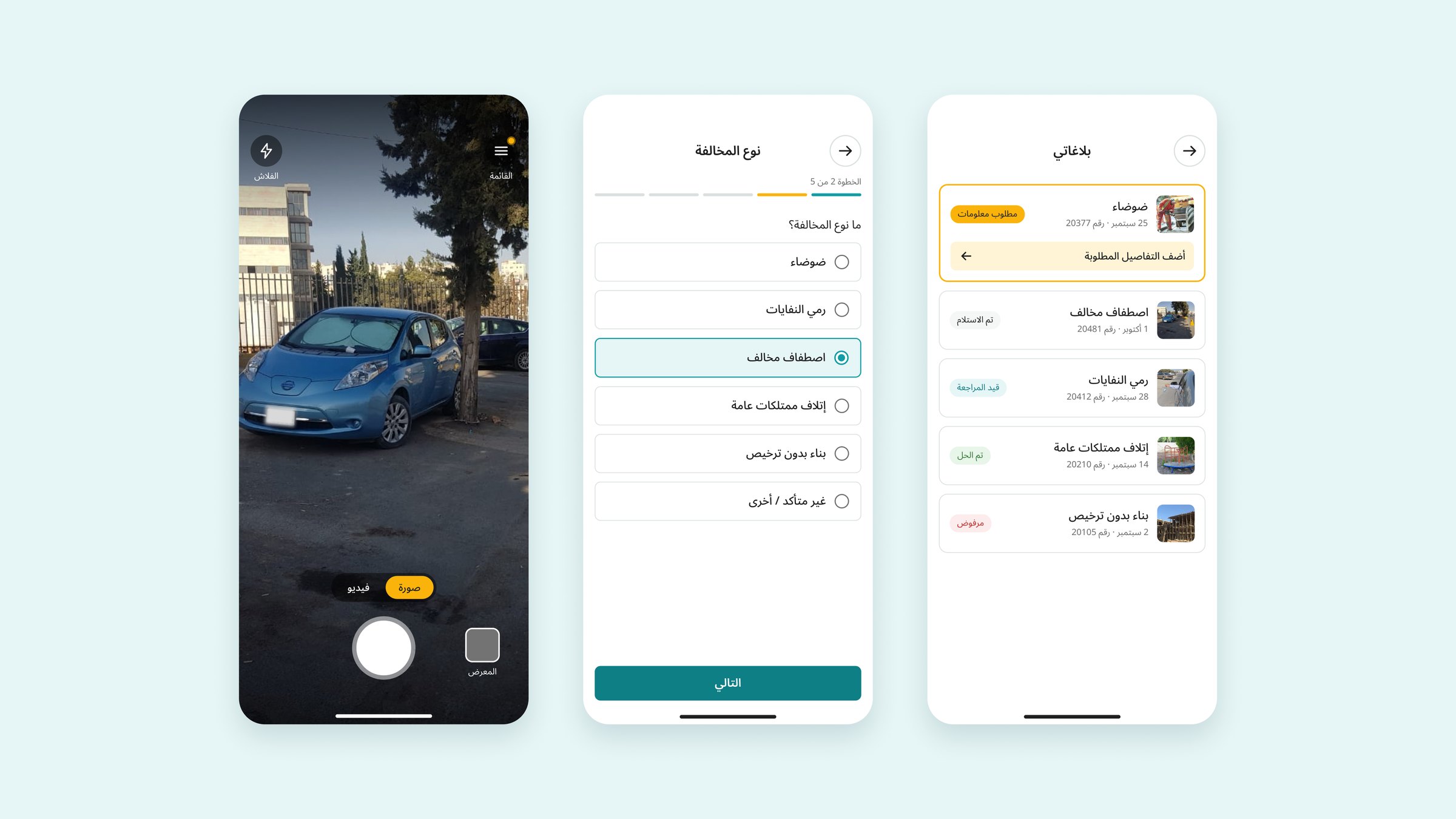
Overview
Shayfak (شايفك, “I see you”) lets people report public violations, like illegal parking or damaged property, with a photo and a location in under a minute.
I designed the app's interface and visual identity for a government client in 2020. The project stopped before launch. In 2026 I went back to it and redesigned the whole experience as an Arabic-first, right-to-left app: from the camera to following a report until it's resolved.
Where it started: the 2020 screen
- An unclear photo areaThe logo filled the space where the photo goes, so it wasn't obvious that people needed to add evidence there.
- A form that contradicts itselfA "Violation type" field sat next to a "Good behavior" option. Labels beside the fields also left little room on a small screen.
- Buttons competing for attentionThe camera and video buttons overlapped, making them hard to tell apart and easy to mis-tap.
- No review, no feedbackSend floated alone in the corner. After tapping it, people had no confirmation and no way to follow their report.
- Missing essentialsNo location, no word on privacy, and an English, left-to-right layout for an Arabic-speaking public.
The problem
People see violations every day but rarely report them, because reporting feels slow, risky and pointless. Client feedback and my own review of the original flow pointed to the same four gaps:
- Slow: too many fields stood between seeing a violation and sending it, so the moment passed.
- Risky: people worried the person they reported would find out who they are.
- A black hole: once a report was sent, there was no way to see what happened to it.
- Dead ends: a photo without location data, a violation that fits no category, or a rejected report left people stuck.
Goals
Fast
From opening the app to a sent report in under a minute, with one question per screen.
Safe
People can report without their name reaching the authority, and the app is honest about what stays private.
Transparent
After sending, people always know where their report stands and what, if anything, is needed from them.
Arabic first
Designed right to left from the start, not translated at the end.
How I worked
- Review the 2020 screenWhat broke, and why
- Wireframe all 21 screensIn English and grayscale, to focus on flow
- Structured reviewConsistent example data, clearer states, edge cases
- Clickable prototypeBoth flows connected in Figma
- Arabic visual designComponents, variables and RTL layout
Two flows that meet at the report
Key design decisions
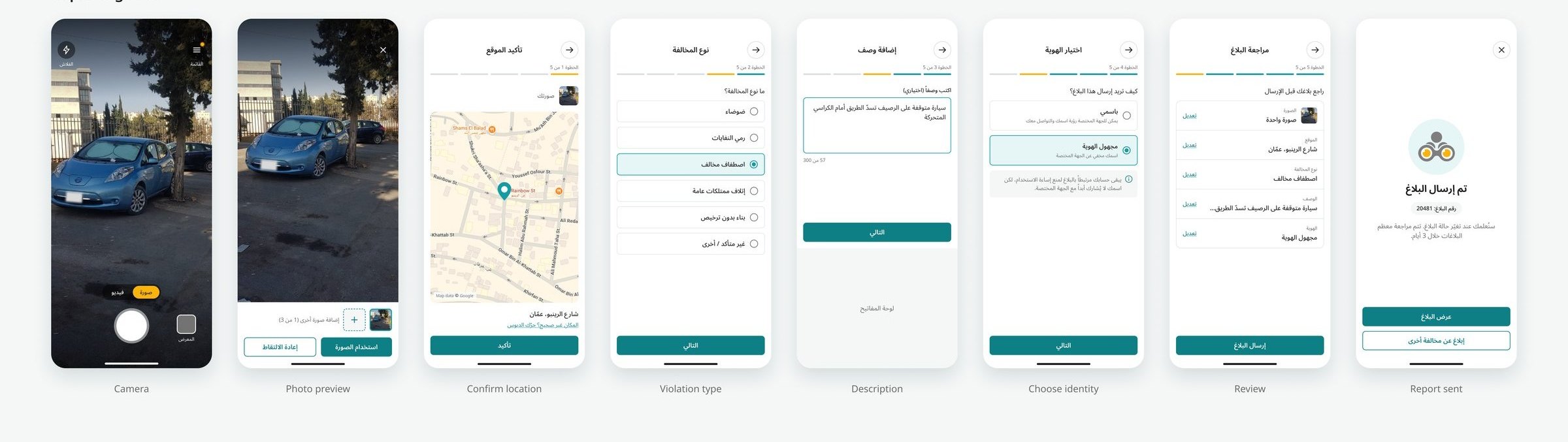
- The app opens straight to the cameraA violation lasts seconds. A home screen in between costs the moment.Fast
- One question per screen, with a 5-step progress barLong forms feel like work. Steps show how close the end is.Fast
- Location is filled in automatically and only confirmedTyping an address is the slowest part of reporting.Fast
- Anonymous reporting, with an honest notePeople fear exposure, but fully untraceable reports invite abuse. The account stays linked; the name is never shared.Safe
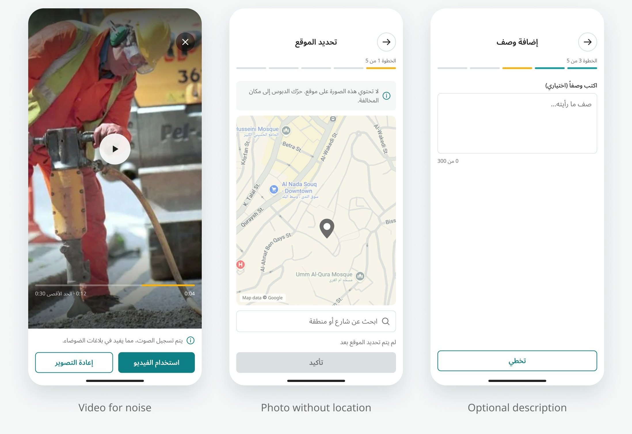
- A photo without location data asks for the pinPhotos shared through messaging apps lose their location. Guessing could send the authority to the wrong place.Safe
- The description is optional, except for “Not sure / Other”Most violations explain themselves. An unknown type doesn't.Fast
- Video alongside photo, with a note that it records soundNoise can't be shown in a photo.Transparent
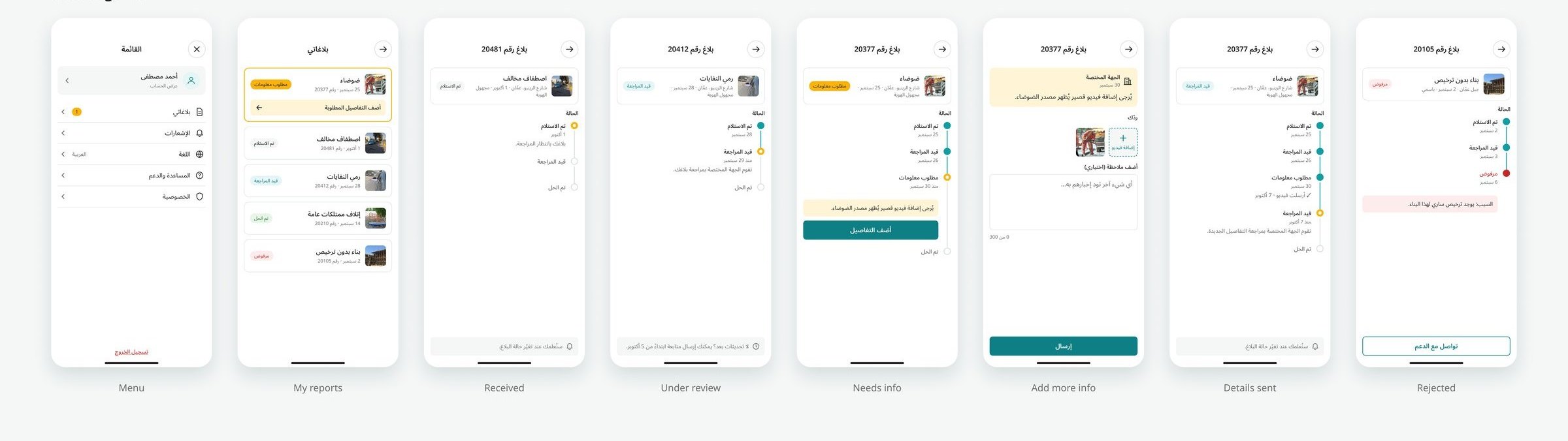
- A “Needs info” loop inside the reportThe authority can ask for more, and the person answers in the same place. Without it, an incomplete report quietly dies.Transparent
- A rejected report always shows its reasonA rejection without a reason feels like being ignored, so it comes with a way to contact support.Transparent
- The success screen has a way outBesides “View report” and “Report another”, a close button for people who are simply done.Fast
The redesign
Reporting a violation
Tracking a report
Designing the edge cases
Visual design
The interface keeps Shayfak's playful brand but adapts it so it stays readable and accessible.
- Typography: the brand's display font suits the logo but is hard to read small, so the interface uses Noto Sans Arabic, with line heights about 1.5 times the font size for Arabic letterforms.
- Accessible teal: white text on the brand teal reaches only about 3.3:1 contrast, so buttons and links use a darker teal (about 4.8:1).
- Yellow means “you are here” or “this needs you”: the current step, the “Needs info” status and the menu badge. Never as text on white.
- A small component library on Figma variables: button, header with progress, option card, text area, summary row, status badge, report card and timeline step.
Designing for RTL
The English wireframes were mirrored, not just translated. Some details only show up once real Arabic text is on the screen.
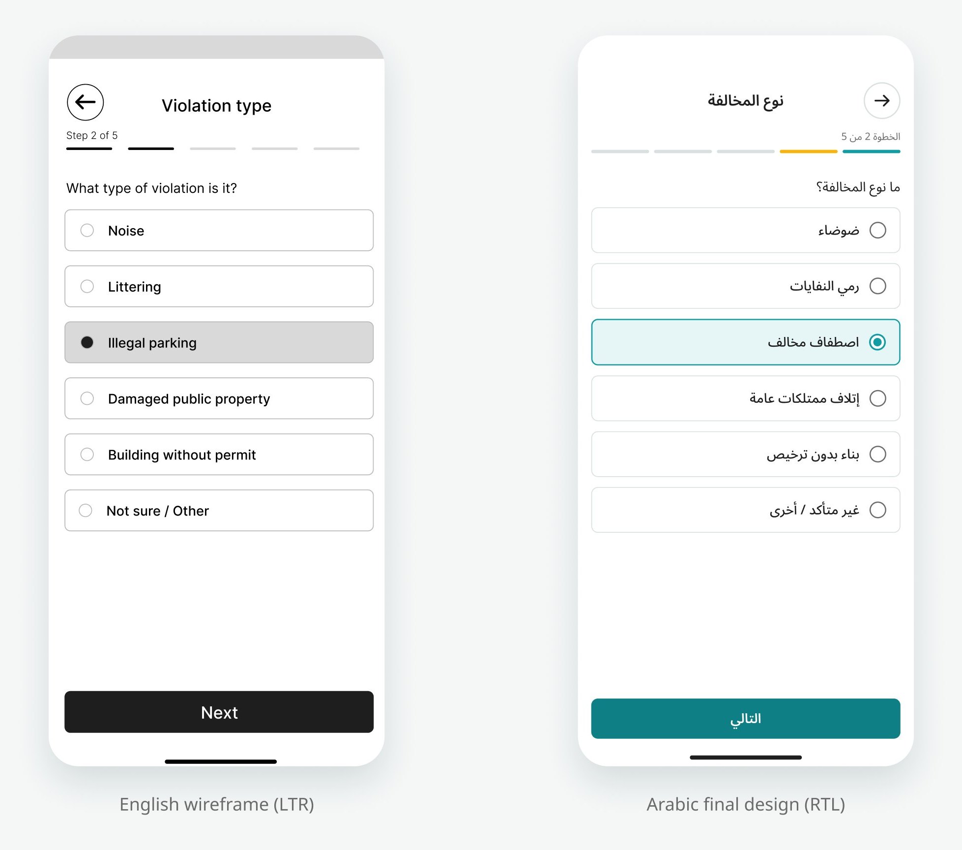
| Element | English wireframe | Arabic final design |
|---|---|---|
| Back button | Top left, arrow pointing left | Top right, arrow pointing right |
| Progress bar | Fills from left to right | Fills from right to left |
| Radio buttons and icons | Left of the text | Right of the text |
| “Edit” links and chevrons | Right side | Left side |
| Character counter | “0 / 300” | “0 من 300” (0 of 300): the slash version flipped to “300 / 0” inside Arabic text |
| Report number | “Report #20481” | “رقم البلاغ: 20481” (Report number): the # sign jumped to the wrong side |
Not everything flips: the play button, the camera controls and the photo itself keep their direction.
What I'd test next
The redesign hasn't been tested with users yet. My first round would be 5 Arabic-speaking users, each asked to report an illegally parked car, then answer an authority's request for more information. I'd look at three things:
- How long it takes to send a report, and where people hesitate.
- Whether people understand and trust the anonymous option.
- Whether people notice and act on a report that needs their input.
How I'd measure success
If Shayfak launched, these are the numbers I'd watch, each tied to one of the four goals:
- Fast: median time from opening the app to a sent report, with a target under 60 seconds, and the drop-off at each of the 5 steps.
- Safe: the share of reports sent anonymously, and how many people leave at the identity step. A high exit rate there would mean the privacy note isn't trusted yet.
- Transparent: the share of “Needs info” requests that get an answer, and how often people come back to check a report's status.
- The real outcome: the share of reports that end up resolved, and how many people send a second report. Someone who reports again believes it mattered.
What I learned
Someone sees a problem, has a few seconds, and needs to know their report will matter.
Redesigning my own earlier work showed me how much of a good experience lives outside the happy path: the photo with no location, the report that gets rejected, the person who is simply done. Designing those moments first made the main flow simpler. Working Arabic-first also taught me that RTL is more than mirroring: numbers, symbols and mixed-direction text need their own decisions.
Next, I'd design the authority's side, a dashboard to review, request info on and resolve reports, and the notifications that tell people their report has moved.